On by default: it starts after your first click on the page, and you can turn it off at any time.
Background music produced and licensed by DingSong.
Issue 1 · Late October 2026
Global Economy and Markets:Hot or Cold?
Stocks, interest rates, the dollar, oil, gold, inflation: 50+ global indicators, updated every two weeks. Each is compared only with its own past normal, to show whether it is higher or lower than usual.
Hot and cold describe position, not good or bad. After similar readings in the past, prices sometimes rose and sometimes fell. We list every case so you can judge. No buy or sell advice.
Reading the numbersEach pendulum’s 0–100 reading is a percentile, like a percentile rank on an exam: 80 means higher than 80% of its own past months, and 50 is its typical level. The big number under the dial is the median of these 17 percentiles (half are higher, half lower); it is not itself a percentile, and it is sorted into the same five levels. The global anchors are 17 core indicators chosen from all 59 and followed in every issue.
Data from central banks, the OECD, the World Bank and other public sources.
72warmMedian of 17 global anchorsPercentile; 50 = normal
Time machineTurn the dial back to any month since 1978
The paper strip traces the combined position of the 17 global anchors. Drag the pointer or pick a year to see where each one stood then; click a pendulum to see its links.
Thin lines: one per indicatorThick line = the medianNumbers match the list below
Issue 1 · Late October 2026
This issue’s highlights
OverallThe median of the 17 global anchors stands at 72 (warm). The reading has been warm in 55 of the 69 months since Feb 2021, the rest neutral. Earlier periods when the overall reading was also warm: 1979–1981, 1987, 1999–2001, 2006–2008, 2009–2012 and 2017–2018 (6 in all).
At the extremesGlobal anchors at their own historical extremes (5): US valuation (99), US stocks (94), US 10-yr yield (91) and Copper (91) at the high end; Credit spread (9) at the low end. For most indicators an extreme is uncommon, and not necessarily bad.
HistoryIn the year after each of the 6 earlier warm periods began, US stocks changed by between −10.2% and +16.5%, and over three years, cumulatively, by between −34.6% and +36.8%. Of the months when the overall reading was warm, 38% were still at least warm a year later. This is the historical record, not a forecast.
Highlights are written automatically from the data in fixed sentence patterns, and every issue is archived. See the archive
One entry every two weeks, building up into a history.
Overall
The 17 global anchors combined: where they stand in history now
We take the median of the 17 global anchors’ positions each month, all the way back to 1978. Each month is compared only with earlier months, never with later ones (values are today’s published versions, including later revisions). Hatched areas are earlier periods that were also warm; thin vertical lines mark major events.
Overlay an index:The overlaid indexes show only the shape and timing of the moves, such as what happened after the hatched periods: each is stretched to the chart’s height (a ratio scale, so a doubling always looks the same size) and has nothing to do with the hot–cold numbers on the left or the colored bands. Index values in the readout are monthly averages; Taiwan stocks from 1987.
Data: sources for each of the 17 global anchors are on their indicator pages. Positions and the median: our calculation.
coldcoolneutralwarmhotHatched = earlier periods that were also warm
Where it stands now72, warm
The reading has been warm in 55 of the 69 months since Feb 2021, the rest neutral. Of the 17 global anchors: 12 above normal (60 or higher), 2 below normal (under 40), 5 at a historical extreme. The record so far: of past months at this level, 38% were still at least warm a year later.
What it meansHow to read the median
The median is the middle value: half the anchors are hotter and half are colder. It looks only at whether each indicator is above or below its own normal, not at whether that “high” is good or bad. For example, when the credit spread is at the low end of its history (markets are not afraid of risk), it pulls the overall reading toward the cold side. That is why you should also look at each force and each link below.
When it was here beforeEarlier warm periods (6), plus the current one
US stocks after it began, cumulative1 yr2 yr3 yr
Sep 1979–Aug 198124-month period, warm in 20 of those months · 1980 Oil crisis1 yr+16.5%2 yr+8.9%3 yr+12.7%
Jun 1987–Oct 19875-month period, warm throughout · 1987 Black Monday1 yr−10.2%2 yr+7.4%3 yr+19.6%
Nov 1999–May 200119-month period, warm in 12 of those months · 2000 Dot-com bubble1 yr−0.9%2 yr−18.8%3 yr−34.6%
Jan 2006–Sep 200833-month period, warm in 28 of those months · 2008 Financial crisis1 yr+11.4%2 yr+7.8%3 yr−32.3%
Dec 2009–Jan 201226-month period, warm in 18 of those months · 2011 Euro debt crisis1 yr+11.8%2 yr+12.0%3 yr+28.1%
Nov 2017–Mar 20185-month period, warm throughout · 2018 February stock sell-off1 yr+5.0%2 yr+19.7%3 yr+36.8%
Feb 2021–now69-month period, warm in 55 of those months · 2022 Inflation shockStill under way
For each period, the changes 1, 2 and 3 years after it began are cumulative changes in US stocks (the S&P 500 price, excluding dividends), measured from the period’s first month. The events named beside each period are major events of that time, not necessarily related to the readings here.
Four forces: money, the economy, assets, and amplifiers that make rises and falls bigger. Within each force, indicators follow their numbers on the dial. In Economy and Assets, a higher reading always means warmer, so the indicators can be combined into one trend. In Money and Amplifiers, “high” means different things (high interest rates mean borrowing costs more, while a large Fed balance sheet means more money in the system), so combined they would cancel out; each indicator gets its own small chart.
MoneyThe price and flow of money
“High” means different things for these indicators, so they are not combined; each gets its own small chart.At a historical extreme: 1 (US 10-yr yield)
“High” means different things for these indicators, so they are not combined; each gets its own small chart.At a historical extreme: 2 (US valuation and Credit spread)
Of the commonly cited economic explanations of how indicators are linked, the 58 that involve two indicators we cover were all tested against our historical data: whether the two positions moved together in the direction of the common explanation, and in which years they did not. A link lights up when either end is at a historical extreme. “Agreement” runs from −1 to +1: +1 means they always move together the way the common explanation says, 0 means no visible relationship, and −1 means they always move the opposite way.
The first edition has 59 indicators in 14 categories; the 17 global anchors on the home page are chosen from these. Each category has its own page, where countries can be compared side by side.
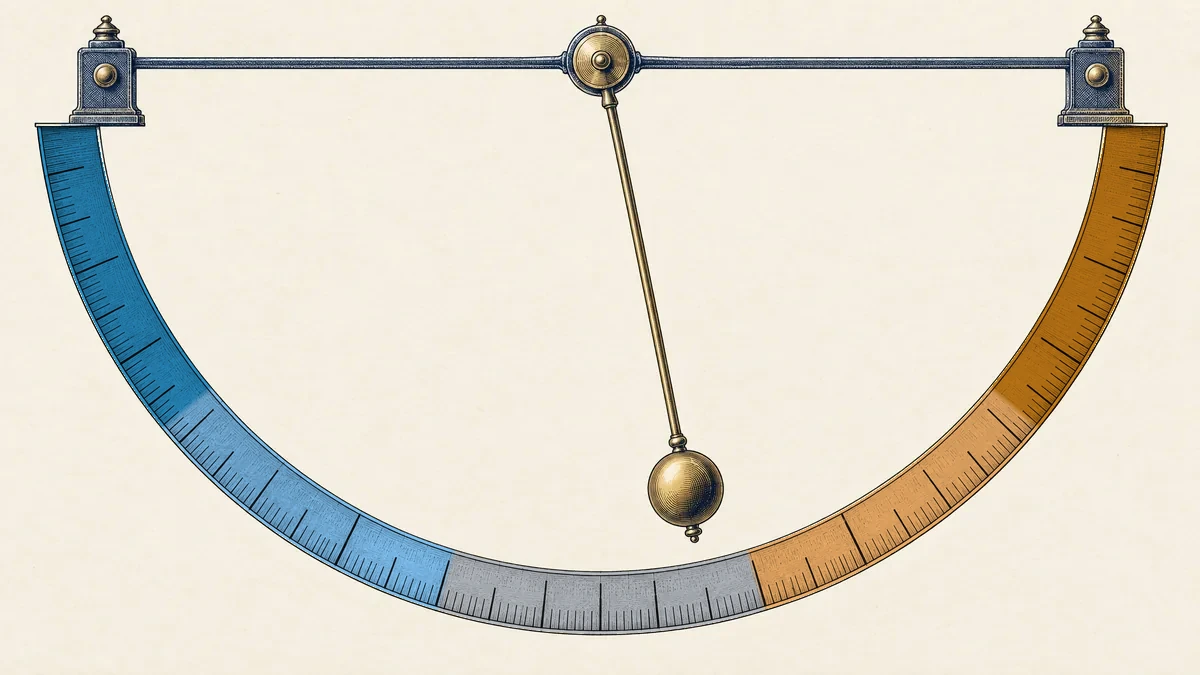
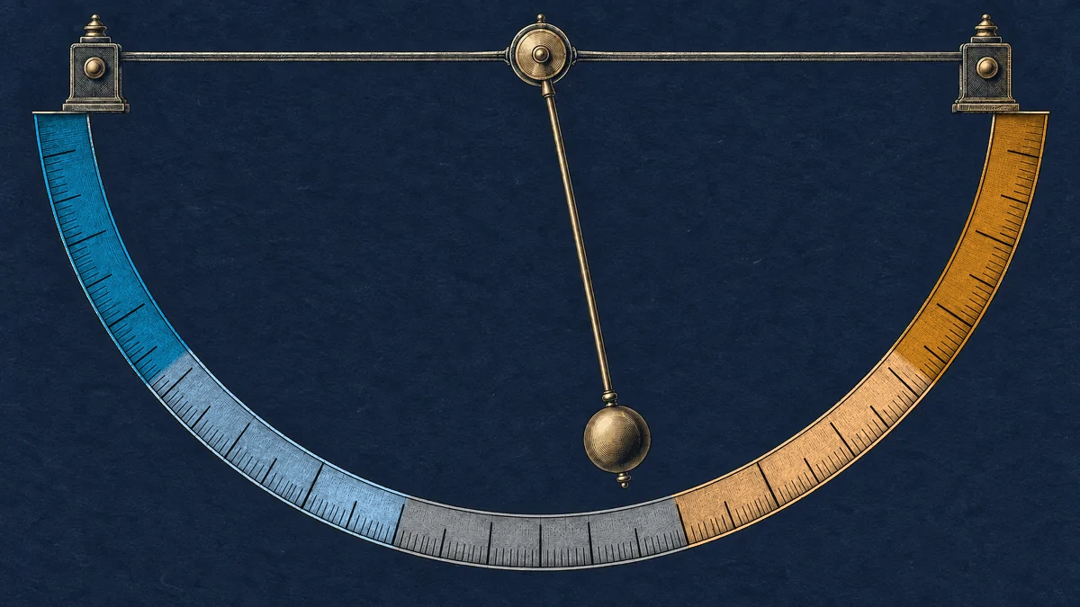
Each indicator is a pendulum. At the center is its own normal level (the 50th percentile).
Above normal, the pendulum swings right and reads warm; below normal, it swings left and reads cool. There are five levels, divided at 20, 40, 60 and 80.
The farther the swing, the less common it usually is. At 90 or above, or 10 or below, the pendulum has reached a historical extreme: the outliers this site sets out to catch. Uncommon, but not necessarily bad.
The pendulum is only a metaphor. Reaching an extreme does not mean it must swing back: sometimes it returns quickly, sometimes it stays high for years.
Each month is compared only with earlier months, never with later ones. What actually happened after the same position in the past is listed in full, rises and falls alike.